# Interpreting Data for Plotting
# How to represent data scientifically
Philosophy of visualizing data
A useful tool is using the acronym **PCC** to enforce legibility of your data. These three principles form the foundation of data visualization and ensure your figures communicate meaning rather than just display numbers.
```mermaid
flowchart LR
A[Purpose] --> B[Composition]
B --> C[Color]
C --> |Clarify| A
```
Whether we are preparing figures for a lab report or a research paper, these three elements should always be applied when presenting data. They ensure that our figures are clear, effective, and convey the intended message to our audience.
- **Purpose** -> What are you trying to communicate? Are you explaining a process, comparing results, showing change, or revealing a relationship?
- **Composition** -> How do you arrange the elements of your figure so that the story is clear?
- **Color** -> How can you use contrast and tone to highlight key insights and guide your viewer’s attention?
Remember: great figures rarely emerge on the first attempt. Iterating, refining layout, simplifying elements, or adjusting colors, helps ensure your data is represented honestly and effectively.
*Remember:* Data don't lie and neither should your figures, even unintentionally.
## Syntax and semantics in Mathematics - The meaning of our data
In the English language, grammar defines the syntax, the structural rules that determine how words are arranged in a sentence. However, meaning arises only through semantics, which tells us what the sentence actually conveys.
Similarly, in the language of mathematics, syntax consists of the formal rules that govern how we combine symbols, perform operations, and manipulate equations. Yet it is semantics, the interpretation of those symbols and relationships, that gives mathematics its meaning and connection to the real world.
As engineers and scientists, we must grasp the semantics of our work, not merely the procedures, it is our responsibility to understand the meaning behind it. YouTube creator and rocket engineer Destin Sandlin, better known as SmarterEveryDay, illustrates this concept in his video on the “backwards bicycle,” which demonstrates how syntax and semantics parallel the difference between knowledge and understanding.

## Purpose - Why?
> Does the figure show the overall story or main point when you hide the text?
Starting with the most important aspect of a figure is the purpose. What do you want to show? Why are we showing this? What is so important? These questions will help us decide on what time of plot we need. There are many types of plots and some are better for different purposes.
Often in engineering you find yourself **comparing** or **contrasting** or **show a change** between sets of data. For these cases you should use either a *line chart* or a *scatter plot*. This is often used when plotting mathematical function.
In a lab report you may find yourself **explaining a process**. For this you may want to use a: *flowchart*, *diagram*, info graphic, illustration, *Gantt chart*, timeline, .etc.
There are many other types of plots that you can choose from so it can be useful to think about who you're sharing your data with. This may be
- Colleague/Supervisor .etc
- Research conference
- Clients (may not always be technical professionals).
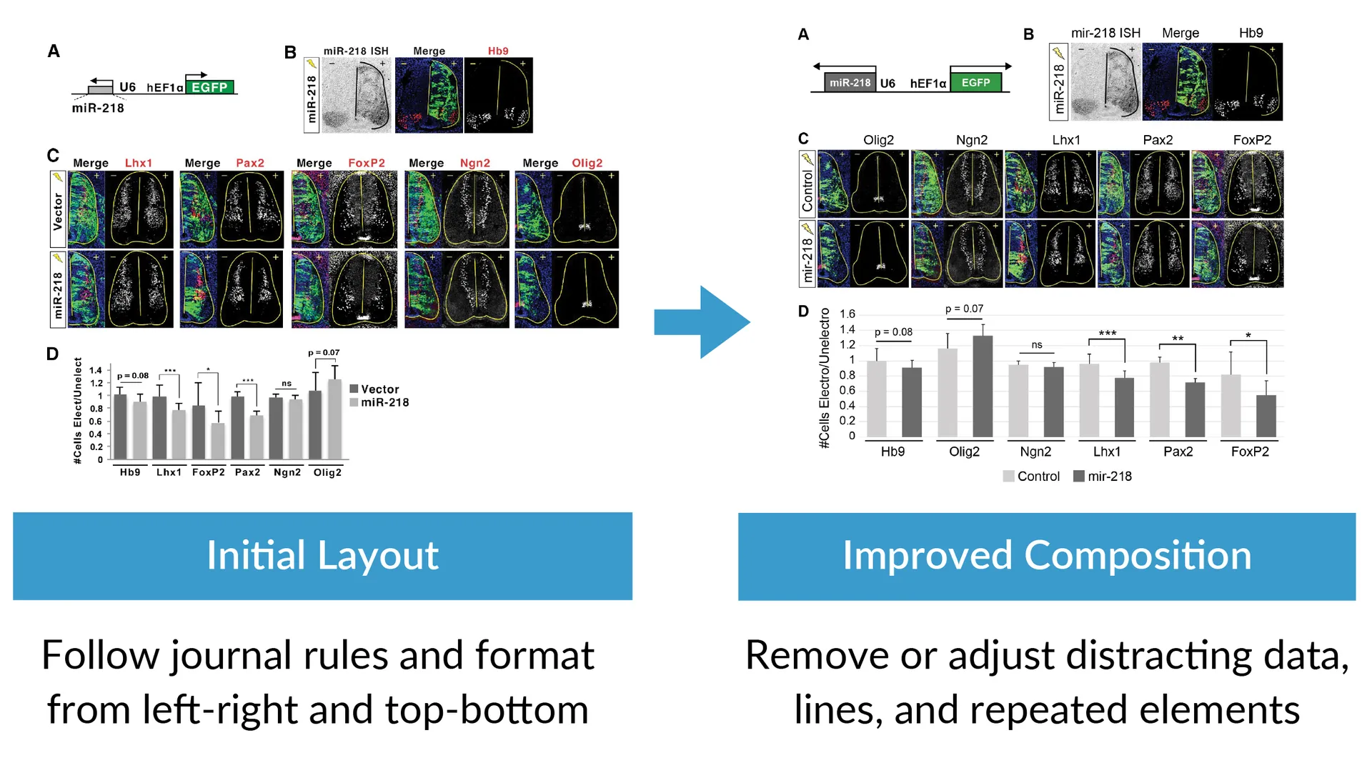
## Composition - Making good plots
>Can you remove or adjust unnecessary elements that attract your attention?
Composition refers to how you choose to format your plot, including labeling, gridlines, and axis scaling.
Often, the main message of a figure can be obscured by too much information. To improve clarity, consider removing or simplifying unnecessary elements such as repetitive labels, bounding boxes, background colors, extra lines or colors, redundant text, and shadows or shading. You can also reduce clutter by adjusting or removing excess data and moving supporting information to supplementary figures.
If applicable, be sure to follow any additional formatting or figure guidelines required by your target journal.
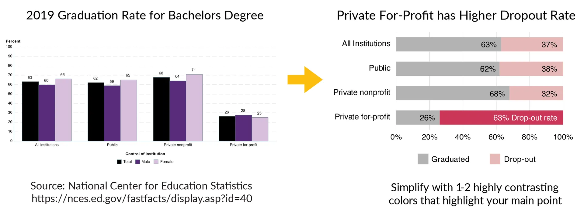
 ## Color - Highlight Meaning
>Does the color palette enhance or distract from the story?
Similarly to composition using color or the absence thereof (gray scale) can help you draw the attention of the read to a specific element of the plot. Here is an example of how color can be used to enhance the difference between the private-for-profit.
## Color - Highlight Meaning
>Does the color palette enhance or distract from the story?
Similarly to composition using color or the absence thereof (gray scale) can help you draw the attention of the read to a specific element of the plot. Here is an example of how color can be used to enhance the difference between the private-for-profit.
 Checklist
- [ ] Select appropriate type
- [ ] Labels
- [ ] Grid
- [ ] Axis
- [ ] Clarity
## Problem 1:
```python
import matplotlib.pyplot as plt
import numpy as np
# Pseudo data
time_s = np.linspace(0,300,15)
temperature_C = 20 + 0.05 * time_s + 2 * np.random.randn(len(time_s))
# Plot
plt.figure(figsize=(8,6))
plt.plot(time_s, temperature_C, 'r--o', linewidth=5)
plt.title("Experiment 3")
plt.xlabel("x")
plt.ylabel("y")
plt.grid(True)
plt.legend(["line1"])
plt.show()
# Plot (IMPROVED)
plt.figure(figsize=(7,5))
plt.plot(time_s, temperature_C, color='steelblue', marker='o', linewidth=2, label='Measured Temperature')
plt.title("Temperature Rise of Metal Rod During Heating", fontsize=14, weight='bold')
plt.xlabel("Time [s]", fontsize=12)
plt.ylabel("Temperature [°C]", fontsize=12)
plt.grid(True, linestyle='--', alpha=0.5)
plt.legend(frameon=False)
plt.tight_layout()
plt.show()
```
## Data don't lie
And neither should your figures, even unintentionally. So it's important that you understand every step that stands between your raw data and the final figure. One way to think of this is that your data undergoes a series of transformations to get from what you measure to what ends up in your final results. Nothing in the workflow should be a magic "black box".
## Problem 2: Misleading plots
Checklist
- [ ] Select appropriate type
- [ ] Labels
- [ ] Grid
- [ ] Axis
- [ ] Clarity
## Problem 1:
```python
import matplotlib.pyplot as plt
import numpy as np
# Pseudo data
time_s = np.linspace(0,300,15)
temperature_C = 20 + 0.05 * time_s + 2 * np.random.randn(len(time_s))
# Plot
plt.figure(figsize=(8,6))
plt.plot(time_s, temperature_C, 'r--o', linewidth=5)
plt.title("Experiment 3")
plt.xlabel("x")
plt.ylabel("y")
plt.grid(True)
plt.legend(["line1"])
plt.show()
# Plot (IMPROVED)
plt.figure(figsize=(7,5))
plt.plot(time_s, temperature_C, color='steelblue', marker='o', linewidth=2, label='Measured Temperature')
plt.title("Temperature Rise of Metal Rod During Heating", fontsize=14, weight='bold')
plt.xlabel("Time [s]", fontsize=12)
plt.ylabel("Temperature [°C]", fontsize=12)
plt.grid(True, linestyle='--', alpha=0.5)
plt.legend(frameon=False)
plt.tight_layout()
plt.show()
```
## Data don't lie
And neither should your figures, even unintentionally. So it's important that you understand every step that stands between your raw data and the final figure. One way to think of this is that your data undergoes a series of transformations to get from what you measure to what ends up in your final results. Nothing in the workflow should be a magic "black box".
## Problem 2: Misleading plots